Creation of design ecosystem for dozens bound IT solutions

Today we will tell you how we had come to the need of creating the single UI/UX system for different applications, for one of our customers. About principles, which were laid in it, and how we packed it technologically. We hope, our experience will be interesting for UI/UX designers, frontend developers, as well as brand managers, which face these challenges from their own experience.

Image
Disign_system_1400x400.png

When an ecosystem is needed. Our experience

For many years now, we have been doing many IT projects of different complexity and directions (public/internal) for one of our customers. Now there are more than 30 projects. In the process, there were minor changes in the design, up to changing the corporate colors. In fact, until some point, design and development had been doing ‘spontaneously’, it means that every project had been done from scratch.

Effects for us, developers, you can forecast by yourself:

  • You need to care about different and constantly-changing for new modules
  • If a form style is changed, you should go and change the design of everything. But more realistic scenario, when you has a zoo (priorities, resources, budgets will provide you with it)
  • Your designers should constantly control frontend developers. And they should write a lot of repeating code

For the customer, such a non-system approach is also unfortunate:

  • Users are uncomfortable at work. When the same person should use several systems with different UX, and control elements are different as well, the frictions appear which can characterize UX as good or bad. Such ‘frictions’ are really painful for users because they do not allow them to work in the stream.

As we have the business systems, users have to use them. Nevertheless, ‘labor productivity’ is not on its maximum.

  • The quality of communications, incl. marketing ones are far away from the ideal. Companies closely care about corporate identity in everything. They describe in detail non-digital holders at the fat brand book – from business cards to souvenir cups with the corporate style. Moreover, the digital communications of a company cannot regulate and lead to a unified form.  As a result, digital holders help to blur the brand.

Design language. Steps of creation

Awareness of hopelessness of the current way, on one nice day, had led us to the mind that the system is a must. And we had started to build it step by step.

Step 1. Defining the main principles

1. Unity

The design language is a system. It should work as a system – you need to understand the principles one and then you use them automatically.

  • Unified net and placement of the key control elements
  • Unified symbols for the typical data. Money, dates, statuses, texts, time, periods…
  • Unified accents, which help to go the right way inside all applications of the system


Image
2


Image
3


2. Simpleness and functionality

Our design language is for business communication. It is not just a decoration. Thus:

  • Interfaces are gotten rid of all non-functional ‘beauties’, which are not useful. We use the minimum of icons. As a rule, they do not make users’ life easier, they force them to play ‘let’s guess’.
  • We could not refuse from all icons, but we use only the required minimum, and not as an independent message, but as an illustration of the information on the page. Icons are the same in all systems, and their list is determined at the UI KIT


Image
4


3. Proactivity

We cut costs of a user for getting results when UI lead him the needed way?

  • We use counter-intuitive associations. Not everyone can remember what CVC code is, not everyone can understand what ‘3 figures on the backside of your bank card’ is, thus on the pages of online payments there are the images of a bank card. In our case, for airline company employees, which do the analysis of the sold carriage, displaying data was made due to the standards of the itinerary receipt (a ticket)


Image
5


  • We consider the perception of colors by a human when choosing color solutions at interfaces. For instance, expenses are indicated by red color in financial docs. Thus, when we develop a financial system, where accountants will be working, we will use familiar colors for them. And this way it is needed to act with every audience


Image
6


4. Flexibility

The system is an organism. It can respond to new realities, not being destroyed.

  • It supports functionality development. Supports different web and mobile platforms


Image
7


  • Leaves the space for creation. The special party decoration or marketing campaigns can be done


Image
10


Step 2. Building a UI Kit

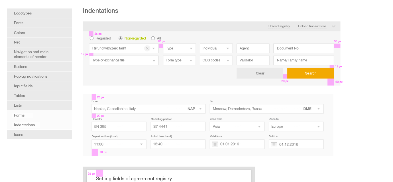
In fact, the embody of ecosystem principles became the creation of the unified UI Kit. For standardization of all elements, we had analyzed all the developed for this customer projects:

  • We had excreted all types of functionality and required elements
  • We had harmonized them with the existing corporate style of the customer, which will be actual in the nearest years

And based on this info, we had projected UI Kit.

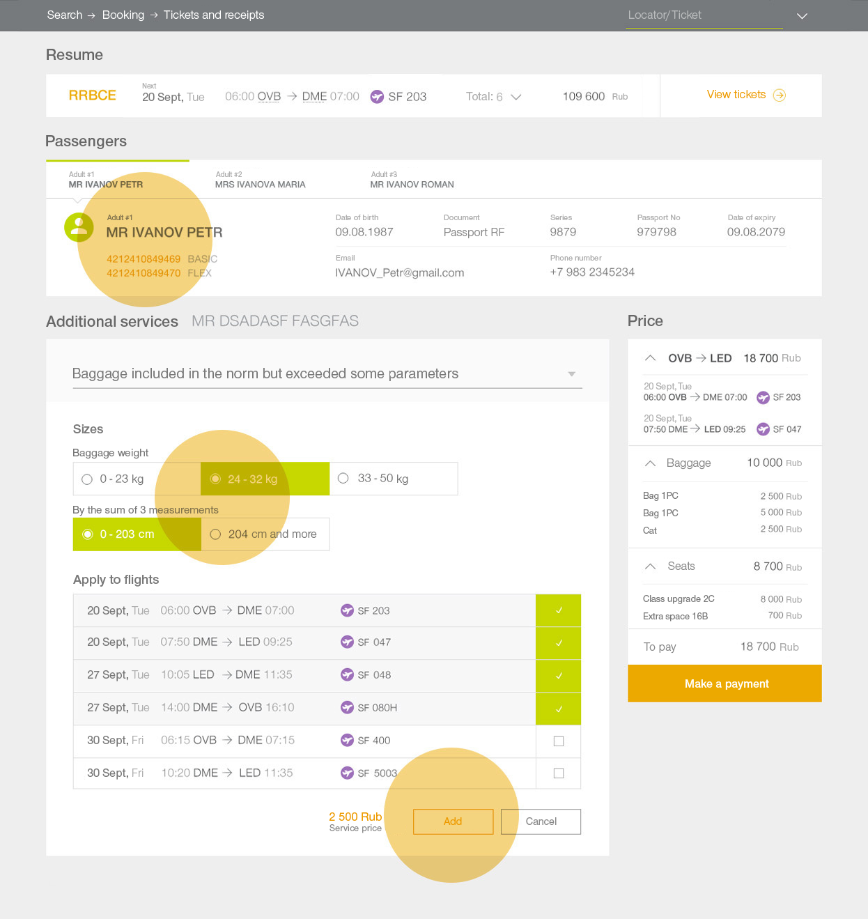
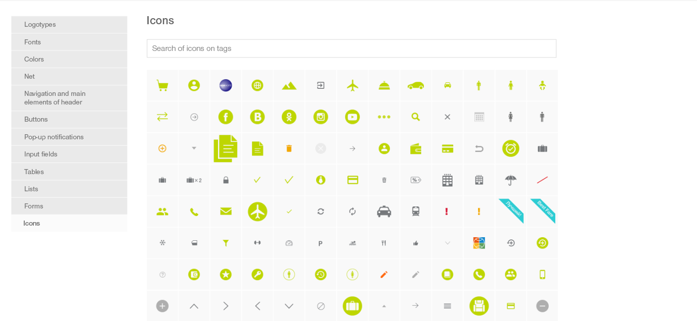
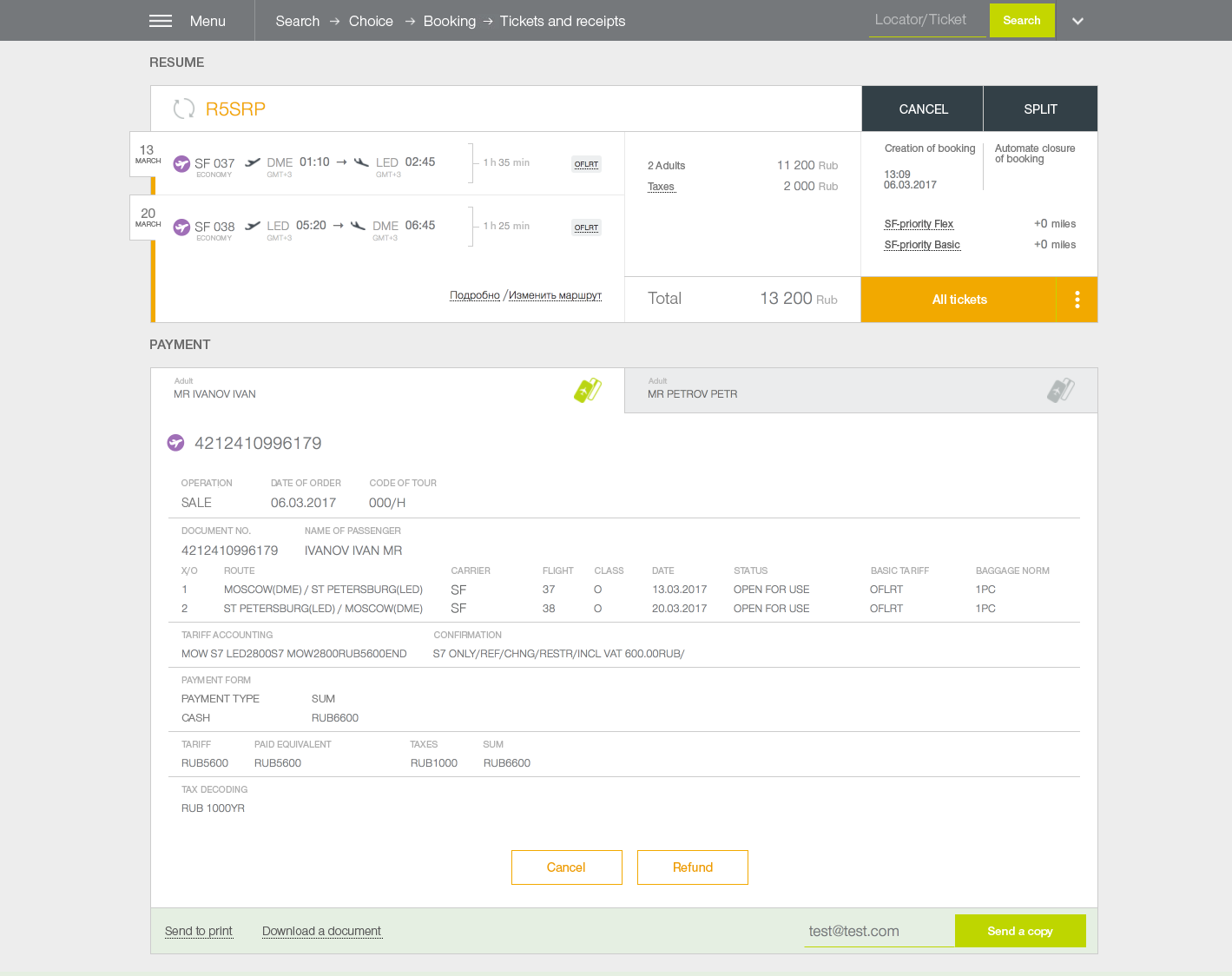
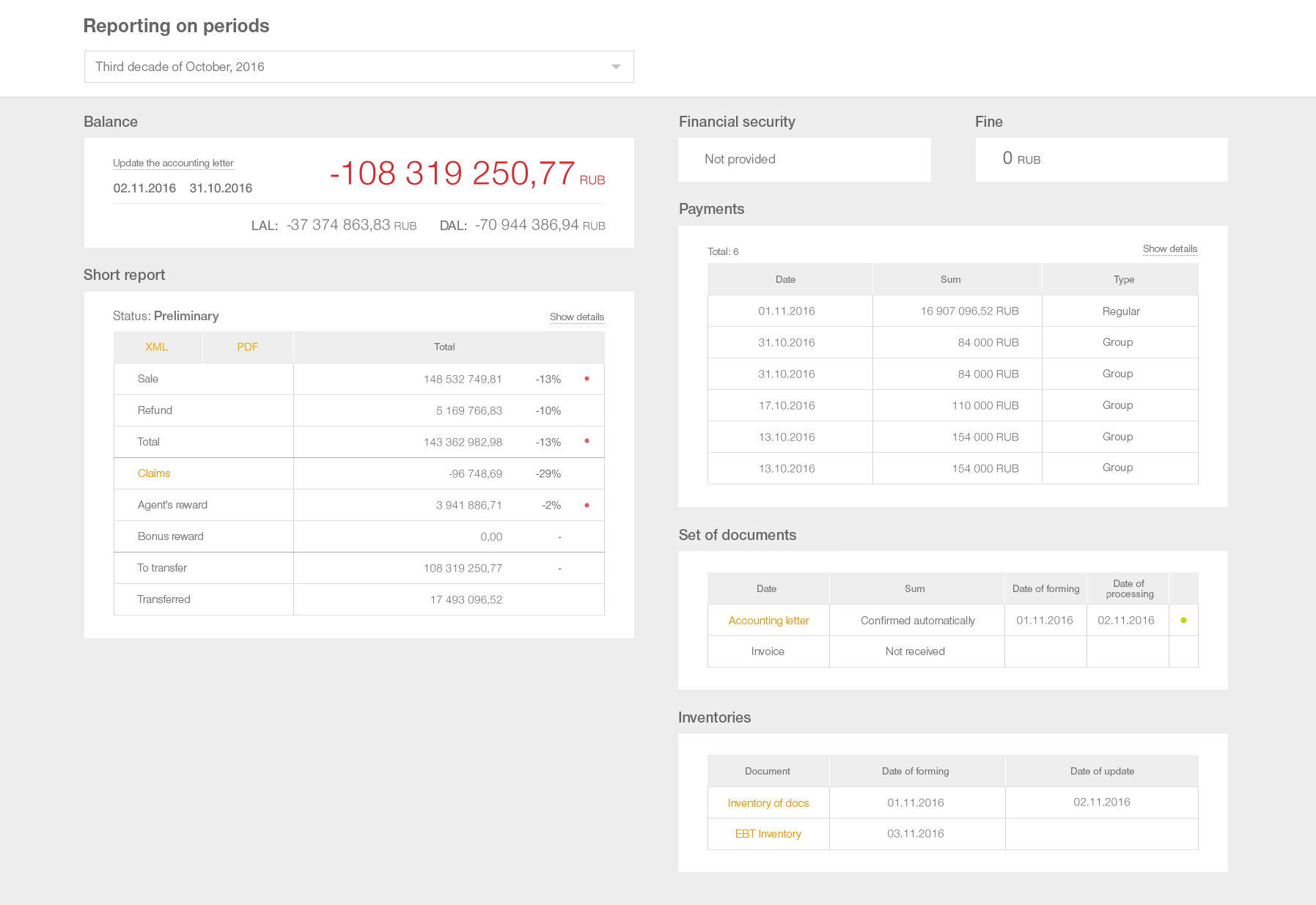
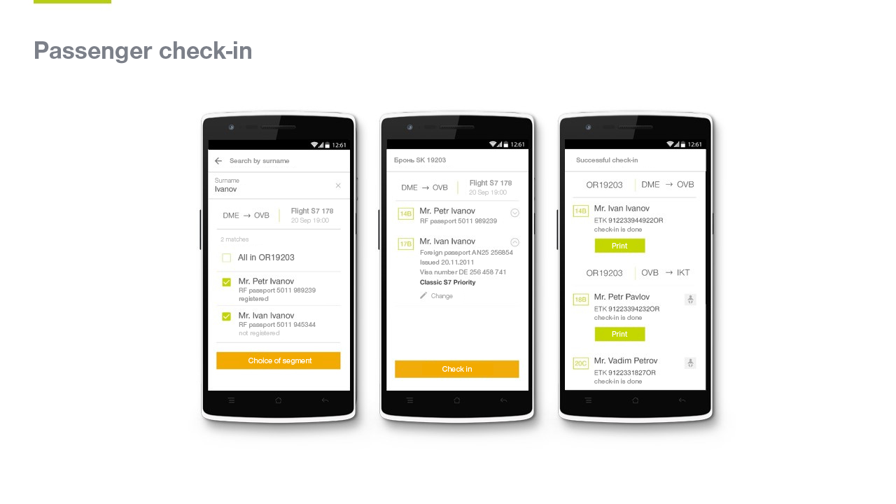
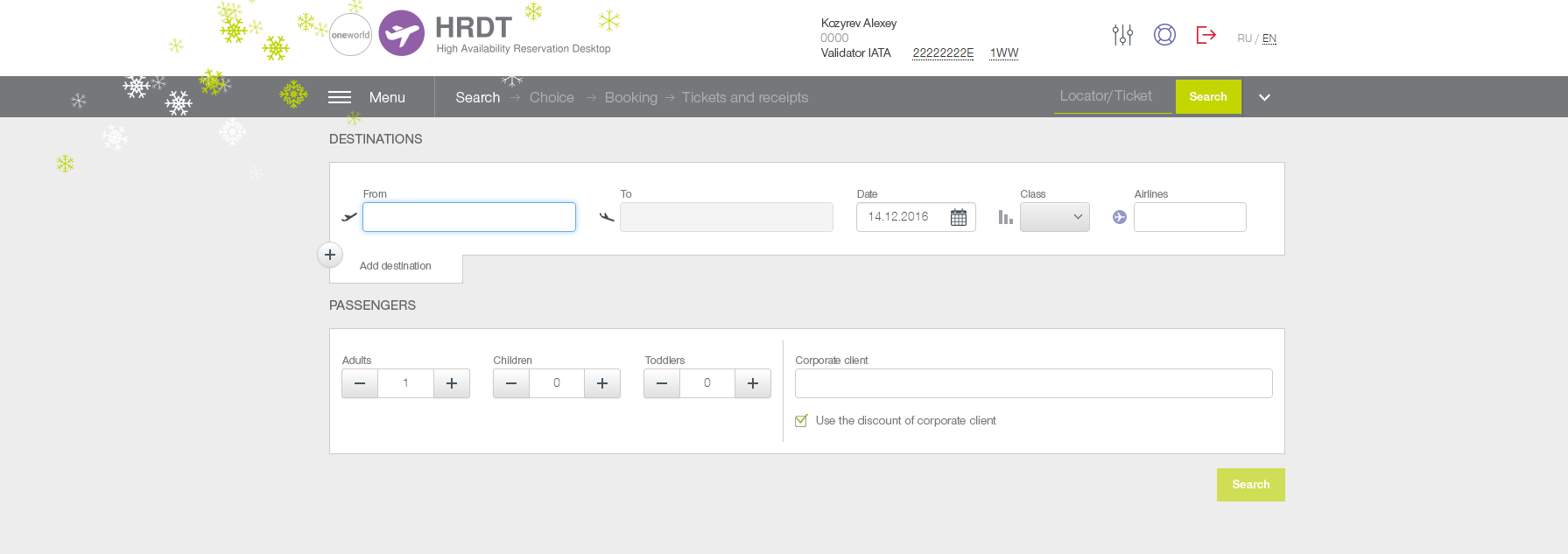
Actually, UI Kit is a continuation of the customer’s brand book, only for digital holders. It collected all typical pages, control elements, and their possible states, as well as the full set of required icons. It allows conducting those tasks, that a usual brand book does – increasing brand awareness, creating the image of the company – only in ‘digital’ space.


Image
11


Image
12


Designers will be building all further projects on the base of this catalog, thinking through only unique for concrete project things. Consequently, a designer now spends more time on projecting an application, elaboration of ergonomics questions, and usability, but do not make styling.

From design to development

The further development of a project rests on the shoulders of developers. Designers will be in the role of customers, censors, and controllers of the technological UI Kit frame, which is made by frontend developers. As our article is design-oriented, now we indicate further steps, but the detailed technical story will be published separately.

Step 3. We pack technologically

The fat plus to the cashier of the design system is a possibility to reuse the code. Of course, we want to write the code only one time, to save time for implementation.  

However, it is needed to remember that implementation will be not one. UI Kit is not a reinforced concrete slab and its update will be continuing after realization of the final system. Sometimes it happens even after they went to the phase of maintenance from the phase of development. Thus it is important to do that developers have the possibility to know about UI Kit updates and understand what exactly has changed and how complicated it can be implemented into the project, they could estimate and plan works on the implementation of these changes.

Except for changes in design, errors at CSS are possible. And these errors should be done and fixed in one place, but not in every system.  

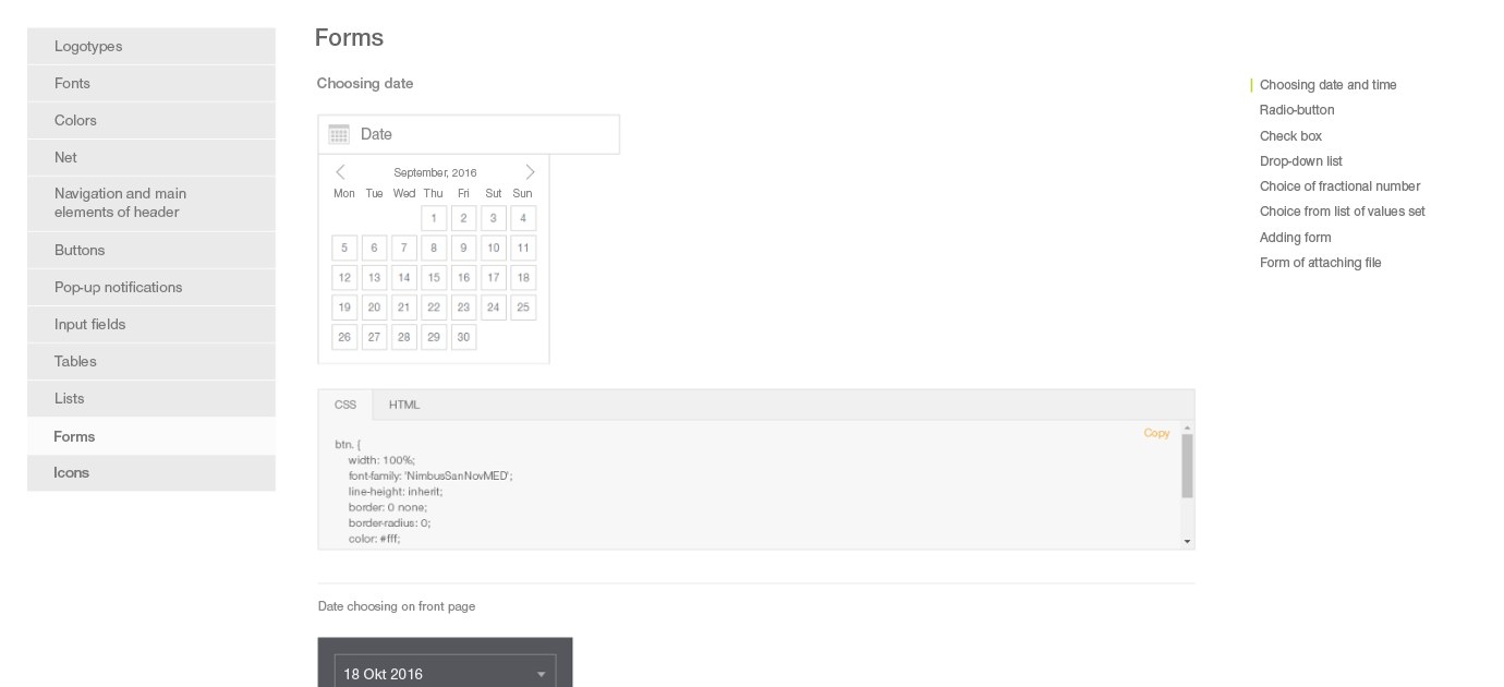
The solution of this task is obvious – we create a library, realizing concepts of the developed design. Physically it looks like the topic for bootstrap, packed at the private npm package. Developers set it ‘over’ bootstrap and get needed design.  

Step 4. Creation of documentation

Instead of long instructions, we created a demo application, where all library possibilities are shown and examples of design, required for the realization of one or other elements, are given. At this demo, customers can ‘touch’ one or other design ideas before their implementation to the final application design. And, if required, add some additional corrections.

In total, let us summarize:

  • We have learned to create our own design ‘language’, tailored to the specifics of the customer’s IT services ecosystem
  • Based on the experience for the concrete customer’s IT services we have turned a zoo into the unified ecosystem
  • We have developed the single UX concept that allows minimizing ‘friction’ when working with our clients
  • We have created a UI Kit that allows our customer to support and develop all their systems in a single style, and for our designers, it saves time while working under design
  • We have done the spread of library updates in the form of npm package, that in combination with right versioning helps us to fix bugs and actualize the design for each project painlessly and independently
  • We have fully illustrated the work of the library via the demo application that allows developers to do not only without designers but as well as without template designers

Our latest publications

See our knowledgebase